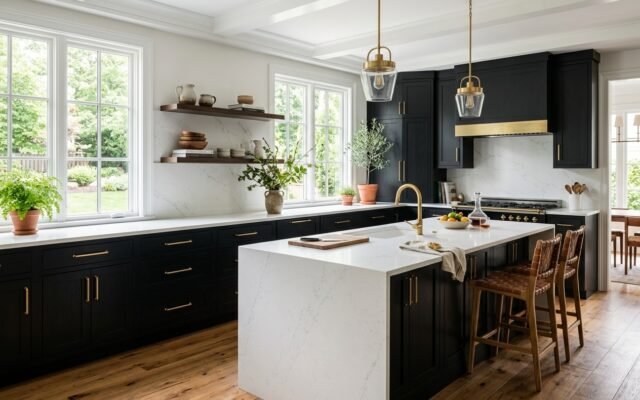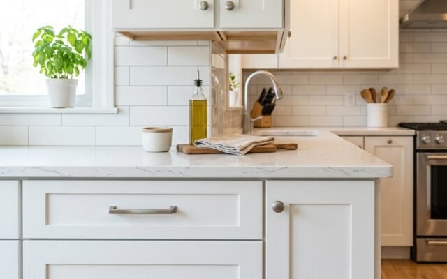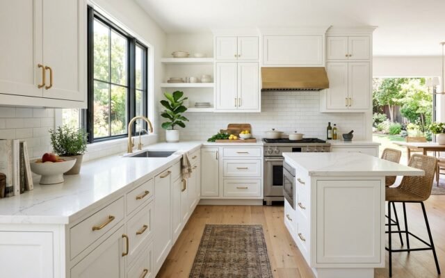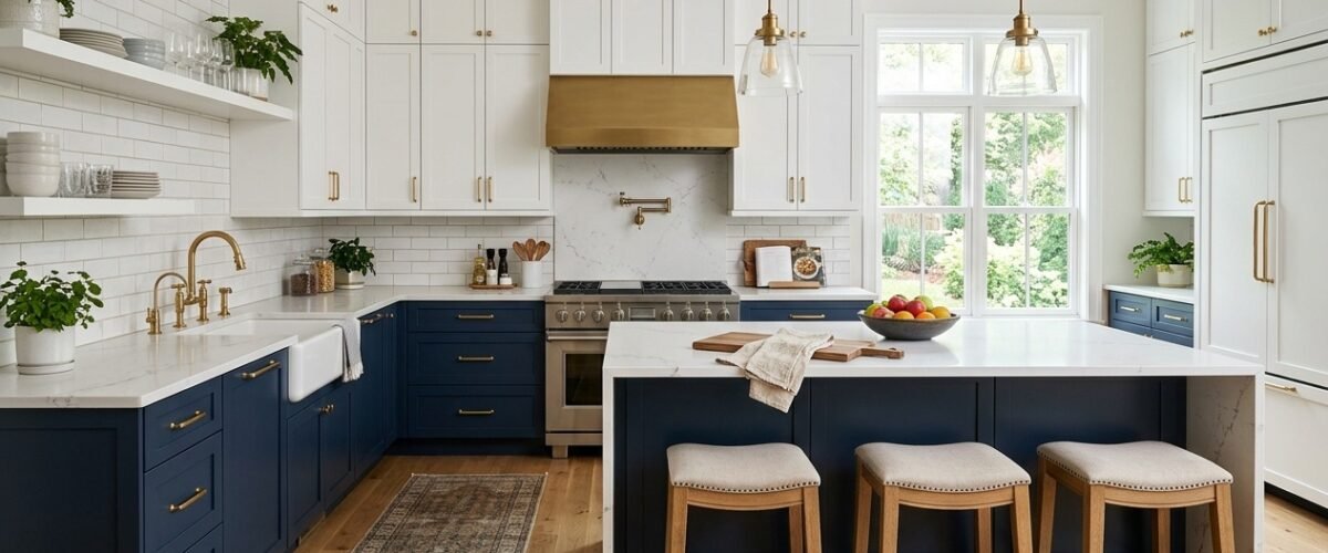
Two tone kitchen cabinets anchor your room by pairing dark base cabinets with light upper cabinets or contrasting islands. When designed correctly, this layout prevents heavy wall cabinets from overwhelming your kitchen while hiding base scuffs. However, mixing colors without clear visual boundaries creates visual clutter. Follow the proven ground rules below to balance contrasting finishes across your remodel.
Quick Comparison of Popular Two Tone Color Pairings
Selecting the right color contrast requires balancing aesthetic weight against daily room lighting. The table below outlines the most durable and visually balanced combinations used by professional kitchen designers.
| Upper Cabinet Color | Base or Island Color | Countertop Recommendation | Hardware Finish | Best Kitchen Style |
|---|---|---|---|---|
| Warm Off-White | Deep Navy Blue | White Calacatta Quartz | Brushed Brass or Satin Bronze | Transitional and Coastal |
| Crisp Pure White | Natural White Oak | Honed Charcoal Soapstone | Matte Black | Modern Scandinavian and Organic |
| Soft Cream | Earthy Sage Green | Warm White Quartzite | Antique Brass | English Country and Farmhouse |
| Light Gray | Rich Matte Charcoal | White Carrara Marble Look | Polished Nickel | Contemporary and Urban |
| Natural Maple | Deep Forest Green | Cream Terrazzo or Quartz | Oil Rubbed Bronze | Mid-Century Modern |
The Three Fundamental Rules of Two Tone Kitchen Design
Contractors and interior designers follow specific color physics when planning two tone layouts. Specifically, three core rules guarantee a cohesive finished project.
Rule 1: Keep the Darker Color on the Bottom
Visual weight pulls the eye toward dense or saturated tones. Because dark colors feel heavier, placing dark cabinets on the bottom grounds the entire room. In contrast, dark upper cabinets make an eight-foot ceiling feel low and oppressive.
In addition, base cabinets receive ninety percent of kitchen kicks, scuffs, and spills. Darker base colors like navy, charcoal, or forest green mask shoe marks much better than pristine white paint. Therefore, this dark lower configuration delivers both aesthetic balance and practical durability.
Rule 2: Choose One Dominant Color
Never divide your cabinetry into an exact fifty-fifty color split. When two contrasting colors occupy identical surface areas, they compete for attention. As a result, the room feels disjointed rather than intentional.
Instead, follow a sixty-forty ratio. For example, make sixty percent of your cabinet faces white and forty percent colored. If your kitchen features a large center island, painting only the island base in the accent tone achieves this proportion naturally.
Rule 3: Unify with Countertops and Hardware
Contrasting cabinets require a consistent design element to tie the space together. Specifically, you can bridge two cabinet colors by carrying identical hardware across every door and drawer. For instance, satin brass pulls look striking against both deep navy and crisp white.
Furthermore, your countertop serves as the horizontal horizon between both cabinet banks. Selecting a white quartz slab with delicate gray veining pulls the light upper tone down while contrasting cleanly with the dark base boxes below.
Popular Two Tone Layout Configurations
You can apply two colors to your kitchen cabinetry using three distinct architectural layouts.
The Upper and Lower Split
The upper and lower split is the classic two tone design. All base cabinets share a dark painted finish, while all upper wall cabinets feature a light shade. Consequently, this configuration makes narrow galley kitchens and L-shaped footprints appear significantly larger than they are.
Moreover, this approach works exceptionally well when paired with shaker vs flat front cabinets. The clean recessed door profiles keep contrasting colors crisp and uncluttered.
The Contrasting Kitchen Island
If you prefer a subtler contrast, keep all perimeter perimeter perimeter wall cabinets uniform and paint only your island base a bold accent color. For example, surround a rich walnut island with bright perimeter cabinets. This approach establishes the island as the culinary centerpiece of the home.
Also, this layout allows you to use more expensive wood species without driving your entire remodel budget through the roof. For more layout ideas, review our guide on kitchen island base cabinets.
The Built-In Pantry or Coffee Bar Accent
A third technique involves isolating a specialized cabinet zone. In particular, you can finish a floor-to-ceiling pantry unit or dedicated dry bar in an accent stain while leaving main kitchen walls neutral. As a result, the accent piece reads like fine freestanding furniture.
Paint vs Stain in Two Tone Kitchen Cabinets
Combining two painted finishes is popular, but pairing painted cabinets with stained natural wood is equally stunning. Each finish type brings distinct physical properties to your project.
| Finish Combination | Visual Impact | Scratch Resistance | Touch-Up Difficulty | Cost Factor |
|---|---|---|---|---|
| Paint Over Paint | Bold, graphic, and modern | Moderate (chipping possible) | Easy (color match paint pen) | Standard ($0 to $300 surcharge) |
| Paint Over Natural Wood Stain | Warm, organic, and textured | High (wood grain hides wear) | Moderate (stain blending required) | 10% to 20% wood grade premium |
| Two Contrasting Stains | Classic and architectural | Very High (penetrating oils) | Moderate (blend markers) | 15% to 25% wood grade premium |
Notice the durability advantages of stained base units in the table above. When you order natural white oak or maple base cabinets, the wood grain absorbs everyday dings without showing bare composite substrates. For an in-depth look at natural wood resilience, check our guide on best wood species for kitchen cabinets.
The Showroom Painter Tape Test
Before committing thousands of dollars to custom cabinet finishes, execute this simple job site inspection test. Obtain large painted sample boards of your two proposed cabinet colors and a sample chunk of your countertop.
First, tape the dark sample board vertically at base cabinet height in your kitchen. Second, tape the light sample board directly above it at upper cabinet height. Next, place your countertop sample horizontally between the two boards. Finally, observe this mock setup under morning sunlight, afternoon natural light, and evening artificial lighting.
Because paint pigments shift drastically under 2700K warm bulbs versus 4000K daylight LEDs, this test reveals undertone clashes immediately. If your white paint looks yellow against your cool gray base swatch, you catch the error before ordering factory finishes.
Real Costs of Ordering Two Tone Cabinets
Homeowners often wonder whether ordering two cabinet colors costs more than a single uniform finish. In reality, cabinet manufacturers handle color combinations differently depending on their production setup.
- Stock RTA cabinet suppliers: Most stock lines charge zero surcharge as long as you order standard catalog colors. You simply purchase navy base SKUs and white upper SKUs at their listed unit prices.
- Semi-custom factory brands: Semi-custom manufacturers typically charge a flat color split fee between $300 and $750. This charge covers separate paint line runs and packaging controls.
- Custom cabinet makers: Custom shops rarely charge extra for two tone finishes unless you request complex multi-step glazes or cerused graining techniques.
In addition, review our detailed guide on cabinet and countertop color combinations to align your backsplash and slab surfaces with your two tone scheme.
4 Common Two Tone Mistakes to Avoid
Contractors frequently see well-intentioned homeowners make predictable color mistakes. Keep these four rules in mind during your planning phase.
- Splitting tall pantry cabinets horizontally: Never paint the top half of a tall 84-inch pantry cabinet white and the bottom half blue. Tall cabinets must remain a single unbroken color from floor to crown molding.
- Ignoring appliance finishes: Stainless steel appliances introduce a third metallic color into your room. If your cabinet colors clash with brushed stainless, the space quickly looks disjointed.
- Mixing contrasting door styles: Stick to identical door frame profiles across both color zones. Combining shaker base doors with slab upper doors distracts the eye and creates stylistic confusion.
- Using mismatched undertones: Always pair warm whites with warm base colors and cool whites with cool bases. A cool blue white paired with warm terracotta brown looks like an accidental mismatch.
Also, verify box construction before buying. Sturdy MDF vs plywood cabinet boxes ensure paint coats bond permanently without seasonal frame movement cracking your perimeter seams.
Frequently Asked Questions
Are two tone kitchen cabinets going out of style?
No, two tone kitchen cabinets remain a major trend in modern residential kitchen remodeling. In fact, pairing painted uppers with natural stained wood islands has become a classic design standard that balances warmth with brightness.
Do two tone kitchen cabinets cost more to buy?
In stock cabinet lines, two tone cabinets cost the same as single color setups because you buy standard catalog parts. However, semi-custom manufacturers often charge a $300 to $750 split finish fee to handle multiple factory paint runs.
Should upper or lower cabinets be darker?
Lower base cabinets should almost always be darker than upper cabinets. Dark lower cabinets ground the room visually, hide scuff marks from foot traffic, and allow light upper cabinets to bounce ceiling light across work counters.
Can you mix different hardware on two tone cabinets?
You can mix knobs on doors and pulls on drawers, but keep the metallic finish identical across both cabinet colors. Using consistent satin brass or matte black hardware unifies the two contrasting cabinet finishes.
What countertop works best with two tone cabinets?
A light neutral quartz countertop with subtle gray or beige veining works best with two tone cabinets. Specifically, light quartz connects the upper white cabinets with dark base boxes without adding competing visual patterns.