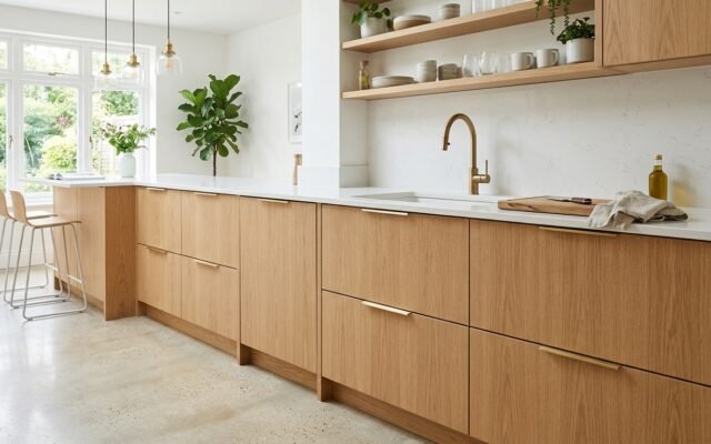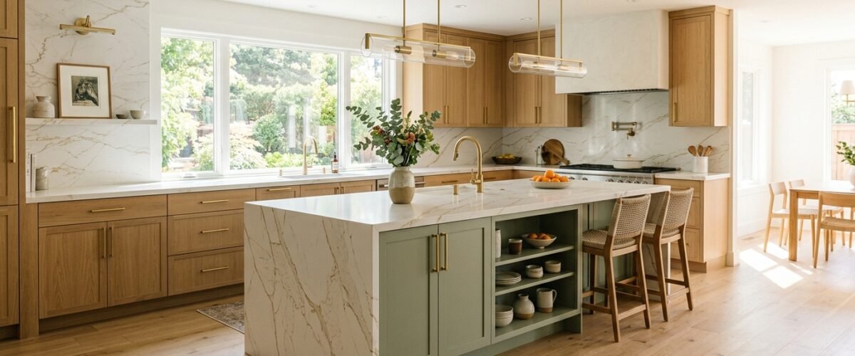
The most reliable kitchen cabinet and countertop color combinations pair warm organic wood tones or muted earth shades with neutral quartz, quartzite, or natural soapstone. In 2026, the standout combination is natural white oak base cabinets paired with warm Calacatta gold quartz. This pairing balances warm honey grain with crisp light reflection while hiding daily water rings and fingerprints.
Most color pairing failures happen in the undertones. Homeowners spend $8,000 on quartz countertops and $12,000 on custom base cabinets, only to realize the cool blue-gray veining in their stone makes their warm cream cabinets look yellow and aged under 3000K LED lighting. Getting the cabinet undertone to match the stone matrix is what makes a kitchen feel custom.
The 12 Master Combination Matrix
Here is how the top 12 kitchen cabinet and countertop color combinations compare across style, maintenance, and material durability:
| Cabinet Color / Species | Countertop Material | Primary Undertone | Maintenance Level | Best Hardware Pairing |
|---|---|---|---|---|
| Natural White Oak | Calacatta Gold Quartz | Warm Gold / Cream | Low (Stain-Resistant) | Aged Brass / Champagne Bronze |
| Sage Green | Matte Black Soapstone | Earthy Cool Green | Medium (Mineral Oil) | Unlacquered Brass |
| Warm Taupe | Taj Mahal Quartzite | Soft Warm Beige | Low (Hard Natural Stone) | Brushed Nickel / Matte Black |
| Navy Blue Base | Pure White Quartz | Crisp Cool Blue | Low (Zero Sealing) | Satin Brass / Polished Chrome |
| Matte Black / Charcoal | End-Grain Maple Butcher Block | Neutral Deep Black | High (Monthly Oil Curing) | Matte Black / Oil-Rubbed Bronze |
| Warm Alabaster Cream | Honed Carrara Marble | Warm White / Gray | High (Acid Sensitive) | Polished Nickel |
| Mushroom Greige | Concrete-Look Quartz | Neutral Gray-Beige | Low (Stain-Resistant) | Flat Black / Gunmetal |
| Deep Forest Green | Warm White Marble Vein | Rich Organic Green | Low to Medium | Antiqued Brass |
| Natural Walnut | Arctic White Quartz | Rich Chocolate Brown | Low (Non-Porous) | Brushed Brass / Matte Black |
| Dusty Coastal Blue | Driftwood Gray Quartzite | Soft Cool Slate | Low (Dense Natural Stone) | Brushed Chrome |
| Tuxedo (Black & White) | Statuario Quartz | High-Contrast Monochrome | Low (Durable Engineered) | Matte Black |
| White Oak + Iron Ore | Calacatta Laza Quartz | Warm Wood + Charcoal | Low (Zero Porosity) | Honey Bronze / Matte Black |
1. White Oak Cabinets + Calacatta Gold Quartz
Natural rift-sawn or quarter-sawn white oak delivers organic texture that softens modern architecture. Pairing white oak with Calacatta Gold engineered quartz creates warmth without yellowing. The warm honey and caramel veining in the quartz picks up the natural grain lines of the oak base cabinets, while the milky white background bounces daylight across your cooking perimeter.
Pair this combination with champagne bronze or satin brass cabinet pulls. Keep your flooring one to two shades darker or lighter than your cabinet boxes to prevent the room from reading as a solid block of wood.
2. Sage Green Cabinets + Matte Charcoal Soapstone
Sage green base cabinets ground a kitchen in timeless heritage style. Soapstone is chemically inert, impervious to acidic lemons or tomatoes, and handles hot cast iron skillets straight off the stove. When treated with dry wax or mineral oil, soapstone darkens to a velvety matte charcoal with subtle white talc veins.
The contrast between the soft gray-green cabinet finish and the dark, tactile stone creates depth that polished granite cannot mimic. Use unlacquered brass hardware that develops a natural patina alongside the living finish of the soapstone.
3. Warm Taupe Cabinets + Taj Mahal Quartzite
Taupe bridges gray and beige, creating a calm backdrop that does not show dust. Taj Mahal is a true crystalline quartzite formed under extreme tectonic heat and pressure. It resists scratching from stainless steel knives and will not etch from vinegar or lemon juice.
Taj Mahal features soft cream, amber, and translucent taupe striations that melt into painted taupe doors. This combination works exceptionally well when planning layout details such as kitchen cabinets next to a window, where incoming natural light illuminates the crystalline depth of the quartzite.
4. Navy Blue Base Cabinets + Pure White Quartz
Dark navy base cabinets anchor the perimeter while keeping the upper visual space crisp. Pairing dark navy with a pure white engineered stone surface (such as Caesarstone Pure White or Silestone Blanco Zeus) delivers high contrast without feeling cold.
To keep navy cabinets from feeling like a cave, run the white countertop material up the back wall as a full-height slab backsplash. This eliminates grout lines and reflects maximum light back into prep areas.
5. Matte Black Cabinets + Hard Rock Maple Butcher Block
Matte black cabinet boxes with flat shaker doors deliver modern industrial punch. Pairing black with end-grain rock maple butcher block softens the stark profile with natural wood warmth.
Butcher block requires food-grade mineral oil or beeswax applications once a month during the first year to prevent drying and checking. If you want butcher block aesthetic without the maintenance around sink cutouts, use maple on a kitchen island prep station and durable quartz around your sink base run.
6. Warm Alabaster Cream + Honed Carrara Marble
Stark hospital white cabinets are fading out; warm alabaster and off-white creams have taken over. Honed Carrara marble features soft feathery gray veining on a warm grayish-white ground.
Honing the marble removes the reflective shine, which hides etching from citrus and wine far better than polished marble. This pairing delivers European bistro elegance, especially when accented with bridge faucets and polished nickel cup pulls.
7. Mushroom Greige + Concrete-Finish Quartz
Mushroom greige is an earthy hybrid tone that shifts between warm stone and muted gray depending on the time of day. Pairing it with concrete-finish matte quartz (such as Caesarstone Rugged Concrete) introduces industrial texture without the porosity and staining flaws of poured cement.
This pairing hides daily kitchen wear exceptionally well. The mottled surface of concrete-look quartz conceals dust, water spots, and crumbs, making it ideal for busy family kitchens.
8. Deep Forest Green + Warm White Marble
Deep forest green provides rich moodiness while feeling classic. When paired with warm white quartz featuring dramatic caramel or brass veining, forest green cabinets command attention as a kitchen centerpiece.
Use forest green on your base cabinets and island, while keeping upper wall cabinets painted in warm ivory or utilizing open wood floating shelves to preserve vertical light balance.
9. Natural Walnut + Arctic White Solid Surface
Black American walnut displays deep chocolate tones, purple undertones, and flowing heartwood grain. Because walnut is visually rich, busy veined countertops create visual chaos.
Pair walnut base cabinets with a calm, seamless arctic white quartz or solid surface countertop. The stark white plane acts as a visual break, letting the natural grain of the wood carcass take center stage.
10. Dusty Coastal Blue + Driftwood Gray Quartzite
Dusty coastal blue has gray and slate undertones that keep it sophisticated rather than juvenile. Pairing it with driftwood gray quartzite or leathered granite introduces subtle earthy texture.
Leathered stone surfaces undergo a diamond-tipped brushing process that produces a slight pebbled texture. This tactile finish softens reflections and resists fingerprints.
11. Tuxedo Black & White + Statuario Quartz
The tuxedo layout uses black base cabinets to anchor the floor and white wall cabinets to lift the ceiling. Statuario quartz acts as the unifying bridge, featuring a bright white base with bold, lightning-bolt charcoal veins that echo the black lower boxes.
This high-contrast combination works best in kitchens with plenty of natural light and tall ceiling clearances.
12. White Oak Perimeter + Iron Ore Island + Calacatta Laza
Two-tone kitchen designs remain a staple for good reason. Using natural white oak on the perimeter cabinets creates warmth along walls, while painting a large central island in Sherwin-Williams Iron Ore (a rich soft black) anchors the center of the room.
Connecting both cabinet colors with a consistent Calacatta Laza quartz top ties the entire room together into a cohesive architectural plan.
The 3 Golden Rules for Undertone Matching
Follow these three technical rules to prevent expensive color clashes between your stone and your cabinetry:
- Never Pair Cool Gray Stone with Warm Cream Cabinets: If your cabinet paint has yellow or beige undertones (like Sherwin-Williams Alabaster or Benjamin Moore White Dove), your countertop veining must contain warm gold, taupe, or soft charcoal. Crisp cool blue-gray veining will make warm cream cabinets look dirty.
- Balance Busy Grain with Quiet Stone: If your base cabinets feature prominent cathedral wood grain (like red oak or hickory), select a solid or finely stippled countertop. If your cabinets are smooth painted shaker, you can afford bold, dramatic slab veining.
- Match Finish Sheens: Pair high-gloss countertops with satin or matte cabinet finishes (20 to 30 sheen). If both cabinets and stone are ultra-glossy, light reflection creates blinding glare under task lighting.
The Showroom Daylight Sample Test
Showroom lighting uses intense 4000K-5000K fluorescent tubes that distort colors. Never approve a countertop slab or cabinet paint chip inside a warehouse.
Take an actual 12×12-inch painted door sample and a stone sample home. Place them directly inside your kitchen on your subfloor or temporary table. Observe them at three specific times: 8:00 AM in natural morning daylight, 2:00 PM in direct overhead light, and 8:00 PM under your installed evening task lights. Only commit to the slab when the undertones harmonize under your home’s actual light conditions.
Frequently Asked Questions
What countertop goes best with white oak kitchen cabinets?
Calacatta Gold quartz and Taj Mahal quartzite are the two best countertops for white oak cabinets. Their warm cream background and subtle amber-gold veining mirror the natural honey undertones of the oak grain.
Should countertops be lighter or darker than base cabinets?
Lighter countertops are generally preferred because they reflect task lighting across prep surfaces and make kitchens feel larger. Darker countertops provide drama and grounding, but show water spots, crumbs, and dust more easily.
What is the most timeless cabinet and countertop combination?
Warm white or light natural wood base cabinets paired with white marble-look quartz and brass hardware is the most timeless combination. It has remained popular across traditional, transitional, and contemporary homes for over two decades.
Does quartz or quartzite look better with painted cabinets?
Both look exceptional, but engineered quartz offers predictable, consistent pattern repetition for modern kitchens, while natural quartzite provides one-of-a-kind crystalline depth and superior heat resistance.
What color countertop makes a small kitchen look bigger?
Pure white or pale cream countertops with minimal veining make small kitchens feel substantially larger by bouncing daylight into corners and eliminating visual boundary lines on work surfaces.