Light cabinets win in small and dim kitchens, but the wrong light colour costs a repaint. Alabaster takes first place on the Light-Upkeep Score at 7.2, with White Dove second at 7.1 and Swiss Coffee third at 6.7. The rest of the list drops fast: the deepest colour here, October Mist at LRV 47, scores 4.1 and only works in a bright room. This guide ranks 7 real paint colours by measured light return minus real upkeep, names the paint code for each one, and shows the 3 mistakes that end in a repaint.
How the 7 Colours Were Ranked: LRV Minus Upkeep
Every colour below is scored the same way. Start with its Light Reflectance Value, the 0 to 100 scale that measures how much light a colour bounces back. Divide by 10, then subtract an upkeep penalty from 0 to 3. The penalty covers three things: how fast the colour shows fingerprints and splashes, how fast it yellows, and how often it needs a wipe-down to look clean. A penalty of 1.0 means a weekly wipe keeps it looking right. A penalty of 3.0 means daily attention.
| Rank | Colour | Code | LRV | Upkeep penalty | Light-Upkeep Score |
|---|---|---|---|---|---|
| 1 | Alabaster | SW 7008 | 82 | 1.0 | 7.2 |
| 2 | White Dove | OC-17 | 83.16 | 1.2 | 7.1 |
| 3 | Swiss Coffee | OC-45 | 81.91 | 1.5 | 6.7 |
| 4 | Agreeable Gray | SW 7029 | 60.1 | 0.3 | 5.7 |
| 5 | Sea Salt | SW 6204 | 63 | 0.8 | 5.5 |
| 6 | Revere Pewter | HC-172 | 55.1 | 0.3 | 5.2 |
| 7 | October Mist | 1495 | 47 | 0.6 | 4.1 |
The table makes the trade-off plain. Whites win on light and lose on upkeep. Greiges lose 20 points of light and gain it back by hiding almost everything. No colour scores above 7.2, because no light colour is both bright and carefree. Pick the score that matches your habits, not the colour that looks best on a chip.
1. Alabaster SW 7008: LRV 82, Score 7.2
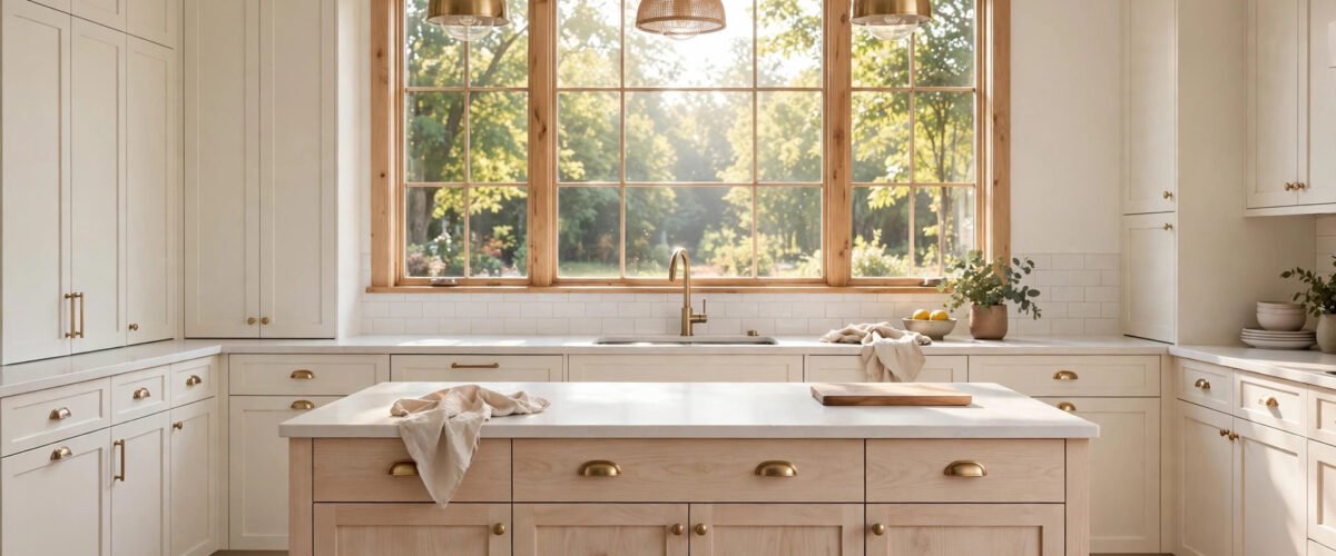
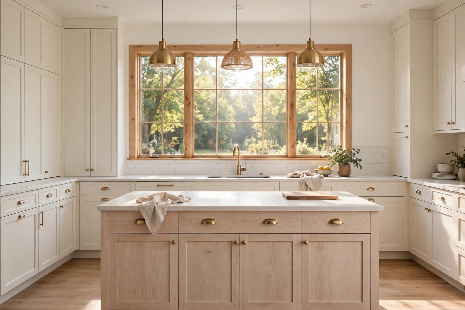
Alabaster is the warm white most kitchens should default to. Alabaster SW 7008 reflects 82 percent of the light that hits it, which puts it just below a true white and well above any colour with a name. Its yellow-beige undertone keeps it from reading cold under LED bulbs, and it was Sherwin-Williams’ 2016 Colour of the Year for a reason: it works in almost any light.
Best for: north-facing and east-facing kitchens, where cool daylight needs warming up. Pair it with white oak, brass, and a countertop that is whiter than the cabinets, so the cabinets read warm by comparison. If the countertop is creamier than the cabinets, Alabaster turns dingy next to it.
Typical cost: a gallon of cabinet-grade enamel runs $55 to $78, and a 10 by 12 kitchen needs 2 gallons plus primer. Downside: yellow undertones go stronger next to white appliances or bright white subway tile, where the cabinets can read dirty instead of warm.
2. White Dove OC-17: LRV 83.16, Score 7.1
White Dove is the softest white on this list and the brightest, at an LRV of 83.16. It carries a grayed yellow undertone that reads cleaner than Alabaster in a room with a cool countertop already installed. Where Alabaster warms a room up, White Dove holds it steady.
Best for: kitchens with cool quartz or marble counters, and rooms with mixed light where a warmer white would shift colour through the day. It is the safest pick when the countertop is already chosen and it runs cool. Pair it with brushed nickel or chrome, which suit its cooler cast better than brass.
Typical cost: same 2-gallon range as Alabaster for a 10 by 12 kitchen. Downside: at LRV 83 it is bright enough to glare in a south-facing room with white counters, and its softness means scuffs show a little faster than on Alabaster, hence the 1.2 penalty.
3. Swiss Coffee OC-45: LRV 81.91, Score 6.7
Swiss Coffee is the creamiest white here, at an LRV of 81.91. It reads almost identical to Alabaster on a chip, then warmer on the wall, with a green-yellow complexity that surfaces under warm bulbs. In a kitchen lit at 2700K it can tip from cream into butter, so test it under your own bulbs before committing.
Best for: traditional and farmhouse kitchens with warm wood floors, where its cream tone ties the room together. It flatters honey oak and walnut better than any other white on this list. Pair it with oil-rubbed bronze or aged brass.
Typical cost: same 2-gallon range. Downside: the highest yellowing risk of the three whites. In a kitchen with heavy cooking, the cream deepens over 3 to 5 years, and the only fix is a repaint. That is the 1.5 penalty.
4. Agreeable Gray SW 7029: LRV 60, Score 5.7
Agreeable Gray is the light colour for people who actually cook. At an LRV of 60.1 it reflects far less light than the whites, but its upkeep penalty of 0.3 is the lowest on this list. Fingerprints, water spots, and cooking splashes barely register on it, which is why it scores above two colours that are brighter on paper.
Best for: busy family kitchens and north-facing rooms, where its neutral undertone stays put in cool light instead of turning blue. It is also the best light colour for resale, because buyers read it as a neutral rather than a colour choice. Pair it with white uppers for a two-tone kitchen, or run it on every cabinet with a white countertop for contrast.
Typical cost: same 2-gallon range. Downside: in a dim kitchen it can read as plain gray rather than greige, and it needs a white countertop or backsplash to keep the room feeling light.
5. Sea Salt SW 6204: LRV 63, Score 5.5
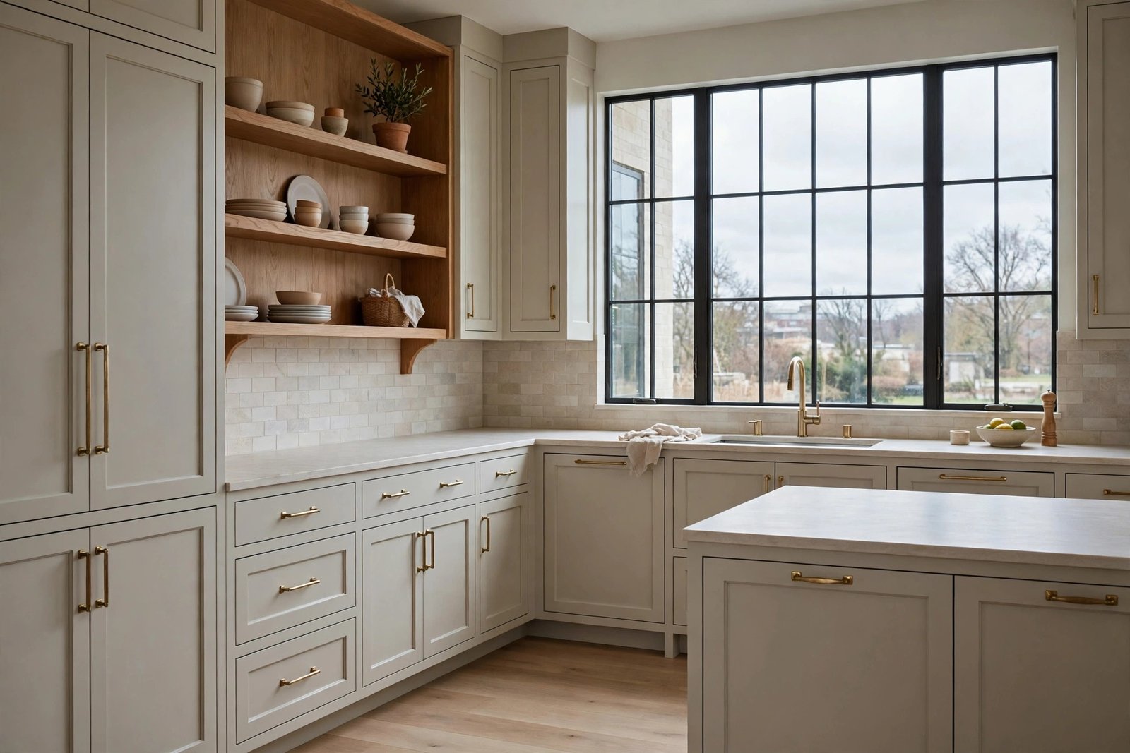
Sea Salt is the lightest colour on this list that is not a white or a greige. At an LRV of 63 it keeps a room bright while reading as a real colour, a pale green-gray with a soft blue lean. In north light it pulls blue-green. In south light it pulls green. That shift is its charm and its risk.
Best for: base cabinets with white uppers, never on both runs. The two-tone split keeps the room light overhead while the colour grounds the lower half. It suits coastal and cottage kitchens, and it pairs well with white oak and brushed nickel.
Typical cost: same 2-gallon range. Downside: the colour shift means a swatch test is not optional. A chip that looks sage in the store can read icy blue in a north-facing kitchen, and the fix is a repaint, not a new backsplash.
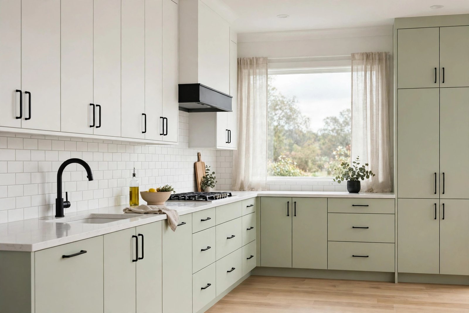
6. Revere Pewter HC-172: LRV 55, Score 5.2
Revere Pewter is the deepest light colour here, at an LRV of 55.1. It is a warm greige with a green-gray base that stays warm and earthy in cool light, which is why it works in north-facing rooms where cooler grays go blue. It hides marks as well as Agreeable Gray, with the same 0.3 penalty.
Best for: bright south-facing and west-facing kitchens that have light to spare, and open plans where the cabinets need to hold their own against a large living space. It pairs well with warm wood floors and black hardware, which sharpen its edges.
Typical cost: same 2-gallon range. Downside: at LRV 55 it is the first colour on this list that can make a small or dim kitchen feel smaller. Do not use it in a windowless galley or a kitchen under 100 square feet.
7. October Mist 1495: LRV 47, Score 4.1
October Mist is the softest sage in common use, a Benjamin Moore Colour of the Year with an LRV of 47. That number is the whole story: it reflects less than half the light of the whites, so it only counts as a light cabinet colour in a bright room. In a dim room it reads as a mid-tone green, not a light colour at all.
Best for: large kitchens with two or more windows, or a south-facing kitchen where the light can carry it. Use it on base cabinets only, with white uppers and a white countertop, so the room keeps its brightness overhead. It pairs well with light oak and unlacquered brass.
Typical cost: same 2-gallon range. Downside: the lowest score on this list for a reason. It needs the most light, shows the most colour shift, and a north-facing kitchen will make it read gray-green and flat.
Pale White Oak: The No-Paint Light Option, Janka 1,360
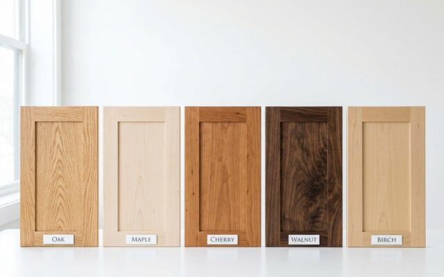
Pale white oak is the light cabinet that never needs repainting, because there is no paint. A clear-finished rift-sawn white oak door stays light while showing grain, so the surface changes as the light moves across the room. A painted door at the same brightness is flat by comparison. White oak also resists dents: it rates 1,360 pounds-force on the Janka hardness scale, harder than red oak at 1,290 and well above walnut at 1,010.
Best for: kitchens where painted cabinets feel too flat, and households that want the light look without the repaint cycle. Rift-sawn cuts give tight parallel grain with no cathedral figure, which is why designers specify them. Plain-sawn oak costs less but shows strong grain patterns that fight a calm palette.
Typical cost: a rift-sawn white oak door costs notably more than a plain-sawn one, and a full white oak kitchen runs above a painted maple kitchen of the same size. Downside: pale oak yellows slowly in strong sun, and it needs a matte clear coat, not a glossy one, or the grain looks plastic under kitchen lighting. For the full species comparison, see our wood kitchen cabinets guide.
Which Light Colour Fits Your Kitchen? 4 Questions Decide It
Answer these four in order. The first answer that points one way decides the pick.
- Which way do the windows face? North or east: pick Alabaster or White Dove. The warm undertone corrects cool light. South or west: pick Agreeable Gray or Sea Salt. The room has light to spare, so spend some of it on colour.
- Is the countertop already chosen? Cool white quartz or marble: White Dove, because its grayed undertone matches. Warm butcher block or cream stone: Alabaster or Swiss Coffee, because warm meets warm.
- How often do you cook? Daily cooking with kids: Agreeable Gray or Revere Pewter. The 0.3 upkeep penalty is worth 20 points of LRV. Light cooking: any white on this list.
- How big is the kitchen? Under 100 square feet or one small window: stay above LRV 80, which means the three whites. Over 150 square feet with two windows: anything on the list works, including October Mist.
If two colours still tie, pick the one with the higher score in the ranking table. The score already weighs light against upkeep, so it breaks ties honestly.
3 Mistakes That Cost a Repaint
Mistake 1: picking from a 2-inch chip. A chip hides undertones. A colour that looks white in the store reads cream, gray, or green on a full cabinet door. Fix: test with 12-inch swatches on the door itself. Cost of skipping it: a full repaint.
Mistake 2: pairing a warm white with a whiter finish. Alabaster next to bright white subway tile or white appliances stops looking soft and starts looking dirty. The cabinets did not change colour. The whiter finish next to them made them look yellow. Fix: make the cabinets the whitest white in the room, or pick White Dove, which holds up better against true white.
Mistake 3: choosing gloss for the wrong reason. High-gloss paint reflects the most light, so it tempts people in dim kitchens. It also shows every fingerprint, brush mark, and dent. Satin is the working finish for light cabinets: it bounces enough light and forgives daily use. Matte hides marks best but chalks on high-touch edges within a year.
The price of any of these mistakes is the same. A professional cabinet repaint typically runs $425 to $1,466, averaging $941, and a 10 by 12 kitchen lands near the middle of that range. For a 10 by 12 kitchen at 28 linear feet, priced at $30 to $60 per linear foot, the worked total is $840 to $1,680 for labour and materials. That is the cost of a wrong colour pick, and it is why the swatch test below is not optional. If your cabinets are already yellowing, read why white kitchen cabinets turn yellow before you repaint, so the new colour does not repeat the same failure.
Test Before You Commit: The 3-Swatch Check
Buy three peel-and-stick samples or three sample pots. Do not buy one. Paint or stick a 12-inch swatch of each finalist on a cabinet door, not on the wall. Then check all three at three times of day and answer these checks.

- At 8am, in morning light: does the swatch read as the colour you wanted, or has it shifted gray, green, or yellow?
- At noon, in full daylight: does it still read light, or does it glare next to the countertop?
- At 8pm, under your kitchen bulbs: does it stay the same colour family, or does it turn butter yellow under 2700K lamps?
- Hold the swatch against the countertop edge: is the cabinet colour warmer or cooler than the counter? Warm cabinets need a cooler counter, and cool cabinets need a warmer one, or the pair fights.
- Hold it against the backsplash: does the white in the tile make the cabinet look dirty? If yes, pick the cooler white.
- Wipe the swatch with a damp cloth: does it mark? A finish that marks on a swatch will mark on 20 doors.
- Look at it from the doorway, 10 feet back: does the room feel brighter with it, or just busier?
- Sleep on it. A colour that still looks right the next morning is the one to order.
If two swatches pass all 8 checks, pick the one with the higher Light-Upkeep Score. For the paint itself, our guide to painting kitchen cabinets covers the method that lasts, and our cabinet paint colours guide lists the exact paint codes for 2026. Under-cabinet lighting also changes how light cabinets read: 3000K warm white strips with the same temperature as your ceiling lights keep the colour true after dark. See our kitchen cabinet lighting guide for the full setup.
Light Kitchen Cabinets: 7 Questions Answered
What LRV should light kitchen cabinets have?
Aim for LRV 60 or higher for the main cabinet colour, and LRV 80 or higher in a small or dim kitchen. Below LRV 55, a colour reads as a mid-tone, not a light colour, no matter what the chip says.
Do light cabinets make a small kitchen look bigger?
Yes, by reflection, not by magic. A white at LRV 82 bounces 82 percent of the light back into the room, which lifts shadows in corners. The effect is strongest when the walls and trim stay close in tone, so the eye reads one continuous surface.
Which light cabinet colour hides fingerprints best?
Agreeable Gray and Revere Pewter, with an upkeep penalty of 0.3. Their mid-tone greige surface breaks up handprints and water spots. Whites show every mark and need a weekly wipe to look clean.
Will white cabinets turn yellow?
They can, over 3 to 5 years, from cooking grease, sunlight, and low-quality topcoats. Creamy whites like Swiss Coffee yellow fastest. A satin catalysed finish and a range hood that actually vents slow it down. See our yellowing guide linked above for the causes and the fixes.
Is pale oak better than painted white cabinets?
It depends on upkeep. Oak never needs repainting and resists dents at 1,360 Janka, but it costs notably more per door in rift-sawn cuts and it yellows slowly in strong sun. Painted white costs less upfront and repaints cleanly.
Should the island match the cabinets?
Not always. A pale oak island with white perimeter cabinets is the most common split, and it works because the island reads as furniture. A darker island also works, but only if the perimeter stays above LRV 80, or the room loses its light.
What sheen is best for light cabinets?
Satin. It reflects enough light to keep the room bright, hides brush marks better than semi-gloss, and wipes clean without chalking. Reserve high-gloss for a small galley that needs every bit of reflection, and matte for display cabinets that nobody touches.